
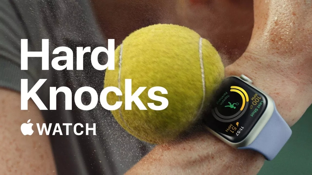
Apple Watch Hard Knocks
Intro
This Reverse Engineer project will analyze the design qualities used in an Apple advertisement. The advertisement pictured above attempts to showcase the durability of the Apple Watch Series 7. Apple, founded by Steve Jobs and Steve Wozniak, released their first personal computer product in 1976. The company is now valued at over $3 trillion. Apple’s offerings include computers, phones, watches, streaming services (Music, Fitness+, News+, Books), and iCloud storage. This innovative company consistently reimagines and improves its products and services. This ad endeavors to relay the strength and durability of the Apple Watch Series 7. The image credit goes to Apple. https://www.imore.com/apple-watch-series-7-takes-beating-new-ad
Analysis
Contrast
The contrast used in the Apple ad really catches the attention of the viewer. The bold white lettering stands out against the subdued color background. The contrast of the thicker and thinner font focuses the eye on the main message first. The eye is grasped by the “Hard Knocks” thick, bold font and typeface. The eye then wanders down to the Apple logo and wording, and finally to the picture in the back. The contrast adds organization to the message. The wording is viewed first, and the image is then viewed which reinforces the message. There is even contrast between the clean lines of the font and typeface and the slightly blurred image behind it. The message becomes interesting and grasps the reader’s attention.
Repetition

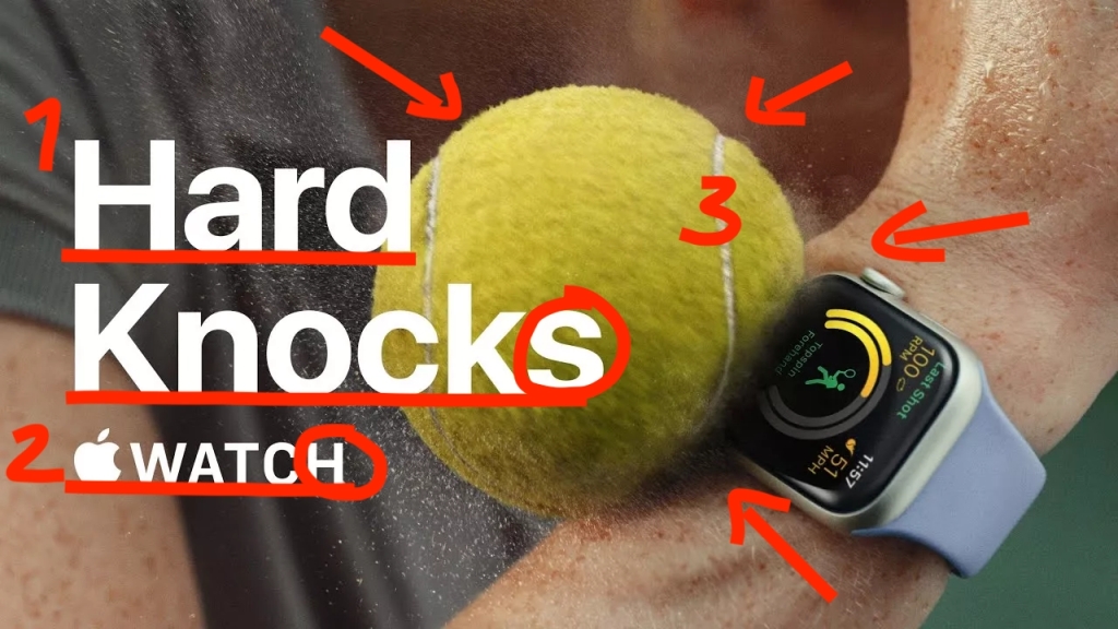
There are some wonderful uses of repetition in this Apple Watch ad. They are displayed in the use of bold font, spacing, and color choice. The use of repetition in this ad helps to organize the information and reinforce the message of strength and durability. The repetition of color adds visual interest and draws the views eyes to the repetitive elements.
Alignment
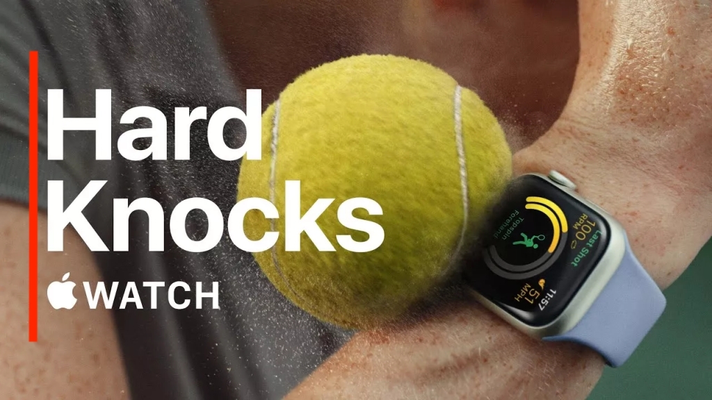
The use of alignment in this ad creates space for the images of the watch, the sweaty arm, and the tennis ball to be clearly viewed. The flush-left alignment gives the ad a strong stylish look that unifies the visual elements on the page. The viewer can tell that every element has been consciously placed in the ad. This helps to sell the message of the ad.
Proximity

The ad does an excellent job with proximity. The way the ball is in close proximity to the watch sends the message of toughness. The ball is actually hitting the watch with force, shown by the moisture flying off the ball and the slightly depressed ball on the arm and watch. It displays movement and force. The image of the ball is in close proximity to the watch because it is displaying the story of the words. The way the font is aligned shows its relation and also displays two separate messages. The brain knows there is only one block of words, but it picks up two messages. The use of proximity organizes the elements of the ad to send a clear meaning.
Color
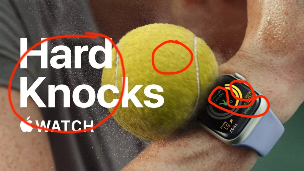
The use of color in the Apple Watch ad is very successful. The use of tints and shades on the watch face adds an element of interest and style. The yellow and green hues are tinted and shaded to keep a fluent complement to the image. The use of white typeface makes the lettering really pop in the advertisement.
Final Thoughts
This ad is very effective. It is well-organized, interesting, and built to grab the reader’s attention. The message is displayed and reinforced through words and pictures. The use of color, contrast, repetition, alignment and proximity is all very sophisticated and professional. There is no room to guess what this Apple Watch advertisement is trying to relay. Apple Watch can take a beating.
