That’s Some Pawsome Type & Photography

Introduction
This two-page magazine spread is taken from Natural Awakenings Pet Magazine. Andrea Shiavone posted this article from a 2014 issue of “Natural Awakenings Pet.” The link to this photo is https://www.behance.net/gallery/21537635/Natural-Awakenings-Pet-Magazine. This magazine spread contains contrasting typefaces and a beautiful image that utilizes the Rule of Thirds.
Analysis
What Typefaces Were Used?

The typefaces used in this magazine spread are Sans Serif and Oldstyle. Sans serif typeface can be recognized by its absence of serifs at the end of the strokes. Furthermore, the letterforms do not have any thick/thin transitions. This means they are the same thickness throughout. Another term for this is “monoweight.” The oldstyle typeface is recognized by its use of serifs, which include bracketing on the lowercase letters. There is also a diagonal stress to these letterforms due to the moderately thick/thin transitions in the strokes.
How Do the Typefaces Contrast?

The oldstyle and sans serif typefaces used in this magazine spread contrast each other beautifully. This is accomplished in many ways. First, the size of the fonts is very different. The title is larger than the headings and paragraph text. The title is in oldstyle and the headers and body paragraphs are in sans serif. The weight of the fonts is moderate. The sans serif headings are bolded and a different color. They really stand out from the paragraphs and title. The weight of the oldstyle title is also greater than the rest of the article. Although it is only a moderate weight, the size, and color help it really make a splash on the page. The structure of the monoweight sans serif is a nice contrast to the moderately thick/thin transitions in the oldstyle typeface. The form of these two typefaces also gives variety to the look of the spread. The form of the ‘a’ in the oldstyle differs greatly from the ‘a’ in the sans serif type. Finally, there is a beautiful and smart use of color in the typefaces. The tint and shade of the green give contrast, yet also unify because they are of the same hue. The body paragraphs are a deep purple which helps their contrast against the white and black backgrounds. There is some use of directional contrast as well. The columns and the title create some nice vertical direction which contrasts slightly with the horizontal direction of the rest of the magazine spread. The author made good use of contrast in this creation.
The Rule of Thirds

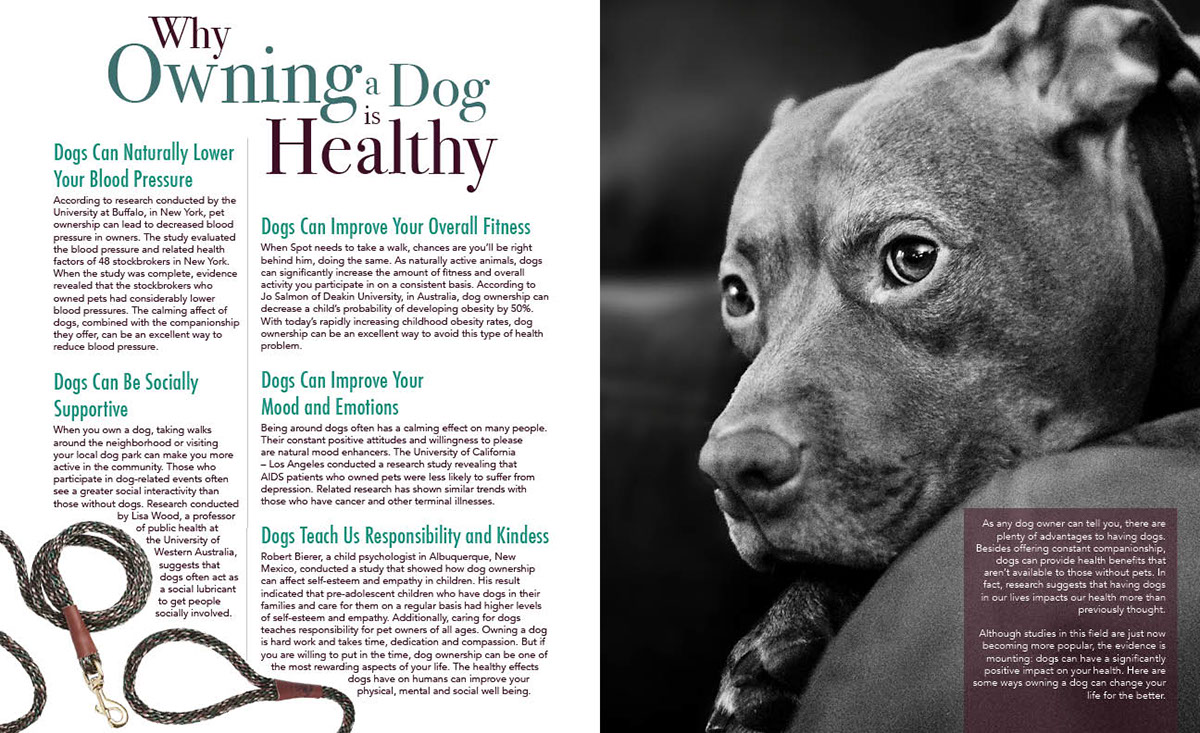
The photographer utilized the Rule of Thirds in the picture of the dog that accompanies this article. Although this is a close-up shot, the Rule of Thirds is evident in the way the eyes of the dog are framed in the picture. Most of the dog is also placed in the right third of the image. This leaves the rest of the photograph more open which draws the reader’s eyes toward the dog.
My Replacement Photos


Why Are My Photos a Good Substitution?
My photos make a good replacement for the original photo. First, they are of the same subject matter. I chose to photograph a dog. Second, I chose to make my photos monotone. These black and white photographs keep with the same theme the original photographer chose. The muted color helps the picture not distract from the information. Third, my photos are close-ups. I strove for similar poses and looks that the photographer chose for their magazine spread. Finally, I utilized the Rule of Thirds in relatively the same way the original photographer did. The subject is slightly offset in my photographs, just like the original photo. Finally, the dogs in my pictures also connect with the reader through the direction of their eyes. I believe that any of my photos could replace the original.
Conclusion
The typefaces help to contribute to the overall design by adding contrast. The contrast between the oldstyle and sans serif typefaces draws the reader to the title and subtitles. The title is splashy and fancy whereas the body of the article is bold and to the point. The photograph which utilizes the Rule of Thirds keeps the picture balanced and attractive to the eye. The photographer’s choice of using a monotone color for the picture helps keep the reader interacting with the script instead of focusing too much on the picture.
