
Introduction
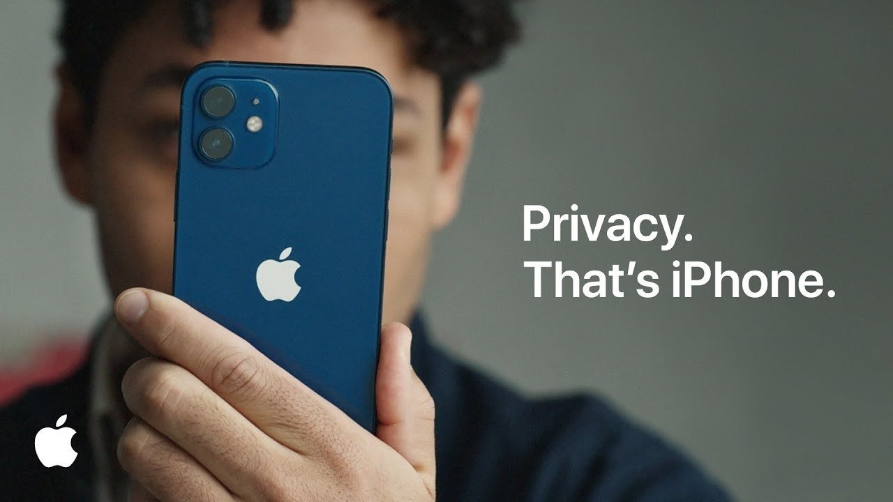
Apple ads are known to be simple and effective, just like the products they promote. The message of this ad is clear–Apple values the privacy of its users. This ad was created by Apple’s organization. Apple aims to bring “the best user experience to its customers through innovative hardware, software, and services.” They work to deliver exceptional products to the public, and the central purpose of their ads is to educate readers on the special qualities of their products. This particular ad focuses on the iPhone and its privacy feature. The location of this ad is: https://appleinsider.com/articles/22/09/05/apple-is-exploiting-features-to-expand-its-own-advertising-say-advertisers
Original Ad Analysis
Design

Although Apple’s ads are simple in design, they are crafty in the way they amplify their message. First, the use of contrast throughout the ad is noticeable. There is contrast between the color of the logo and typeface against the background. There is also contrast between the focused phone and the blurred person. The message and phone really pop on the page because of use of contrast. This creates interest for the reader. Second, there is good repetition in this ad. The apple logo is one example, as well as the use of shades of blue in the phone and shirt. There is also repetition of white in the logo and type. Third, the alignment is done really well. There is superior use of white space due to the placement of the words. The phone and message stand out because of their alignment in the ad. Lastly, the use of proximity is effective. The phone and words stand out on the page because of their forward and focused use. The phone covering the person’s face, and the fact that it is turned away from the reader, unifies and strengthened the message. Apple has designed a very clear, interesting, and important message.
Color

The use of color is simple, yet effective. The navy blue phone stands out against the tan hand and blurred background. There are two shades of blue represented here. The white also stands out against the darker background which brings the apple logo and message to the forefront of the ad. The two blue colors, using the phone and shirt, ad unity to the photo. They are different shades of blue. There are also different shades of white and tan. The repetition in use of color adds unity to the entire ad.
Typography

The typography in this Apple Ad is sharp, simple, and perfectly located. The choice of the Sans Serif font implies no frills, a direct message, and is also easy to read. The size and color of the font make it the second thing that the reader’s eyes are drawn to. The color is a good contrast to the background, and the size makes it easy to read.
New Ad Analysis
Design

The design of this ad makes good use of contrast to add variety and interest for the reader. There is contrast with the white and black phones and the white type on blue background. This contrast helps to catch the reader’s eye, so the message can be absorbed. The proximity of the phones to the message lets the reader know that there is a connection between the phones and the message. The alignment of the message on the right, and how it is centered around the phones also helps with the proximity. There is good use of repetition with color, logos, and even wording to help carry the message that the iPhone can keep your information private.
Color

This ad uses blues, whites, pinks, and blacks to sell the message of the ad. The colors draw the reader’s eyes to the message and to the phones. The repetitive use of these colors also adds unity to the ad. The white font pops on the ad which immediately gets the reader engaged with the ad.
Typography

The typography in this Apple Ad is also sharp, simple, and perfectly located just like its sister ad located above. The Sans Serif font continues to send the message of simplicity and directness to the reader. It pops on the screen due to the color, size, and font choice. The color of the type is a good contrast to the background.
Conclusion
This new ad could also be used with the original ad in the same campaign. They both relay the message that the iPhone is a secure place to keep your information. The message of “Privacy” and “Secrets” both tell the same story. The iPhone keeps a user’s information safe and secure. The way the phone is turned away from the reader is also similar. The continued use of blue, white, and black colors unifies the ads as well. The type is similar in color, size, font, and even location in the ad. I believe these two ads could easily be used in the same campaign.
